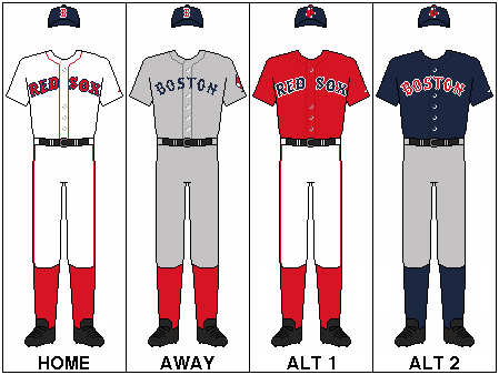
The Red Sox have a new look this year, and I'm very confused by it all.
Quoting from several sources here:
"The
changes were done to put more of an emphasis on returning the visual
elements that have made the Red Sox such an influential brand within
the sport of baseball. The club will also go with the "Hanging Sox" --
which has been around since 1931 as the new primary logo, and it will
be used more frequently and will be displayed on new caps that the Red
Sox will wear with their alternate jerseys at home and on the road.
For long-time fans, the new road jersey will be a trip down memory
lane, in that it will resemble the road grays worn in the 1980s during
the days of Jim Rice, Dwight Evans and Bob Stanley.
The "retro
roadies," as the Red Sox referred to them in a press release, will
feature the word "BOSTON" in blue lettering across the chest.
"The
origin of this was Turn Back the Clock Day in June of '07 in San
Diego," said Red Sox COO Mike Dee. "Everybody thought the gray was a
bluer gray because of the blue lettering. The bordering makes the same
gray look bluer. Basically, we've taken what was the red 'BOSTON' on
the front and replaced that with a blue 'BOSTON.'"
The
alternate road uniform will be a combination of white pants and blue
jersey with "BOSTON" in red lettering across the chest.
No
changes have been made to Boston's primary home uniforms. The alternate
home red jerseys will still be used for Friday night home games, and will now be accompanied by
alternate hats which feature the new "Hanging Sox" logo. The alternate
caps will also be worn on the road with the alternate blue tops for Friday away games.
"If
you look at the outerwear that we wear on the road, we've pretty much
gone to blue as a road color and red as the home color," said Dee.
"This is really an exact continuation of that. We have blue dugout
jackets on the road and red dugout jackets at home; blue BP jerseys on
the road, red BP jerseys at home. This gives us a blue theme to the
road uniform and then a blue alternate top."
The "circle Sox,"
which had been the primary logo, will now be the secondary logo and
will now include better graphics and clearer font. The "B" will be the
third logo.
"The
decision to change [to "Hanging Sox" as the primary logo] was made given the long-time iconic stature of the
'Hanging Sox,' which possesses an instant appeal and recognition of the
team," the club said in a press release.
All the changes were meant to be subtle in nature.
"There's
several changes, but we think they're traditional in nature and
aesthetically pleasing and will be warmly received by the fans," said
Dee.


 Deschutes County


 Mr Wong

Recent Comments